
Preston is a graphic designer and illustrator originally from Corona, California. She lived in North Carolina for seven years, where she went to high school and received her Art Associates at Central Piedmont Community College. Shortly after, her family moved back to California and she began her studies at BGSU. She enjoys drawing, skateboarding, traveling, playing video games, and spending time with friends. She is excited to start working in the design world and hopes to one day be a full time freelancer.
It’s Closer Than You Know // Senior Thesis
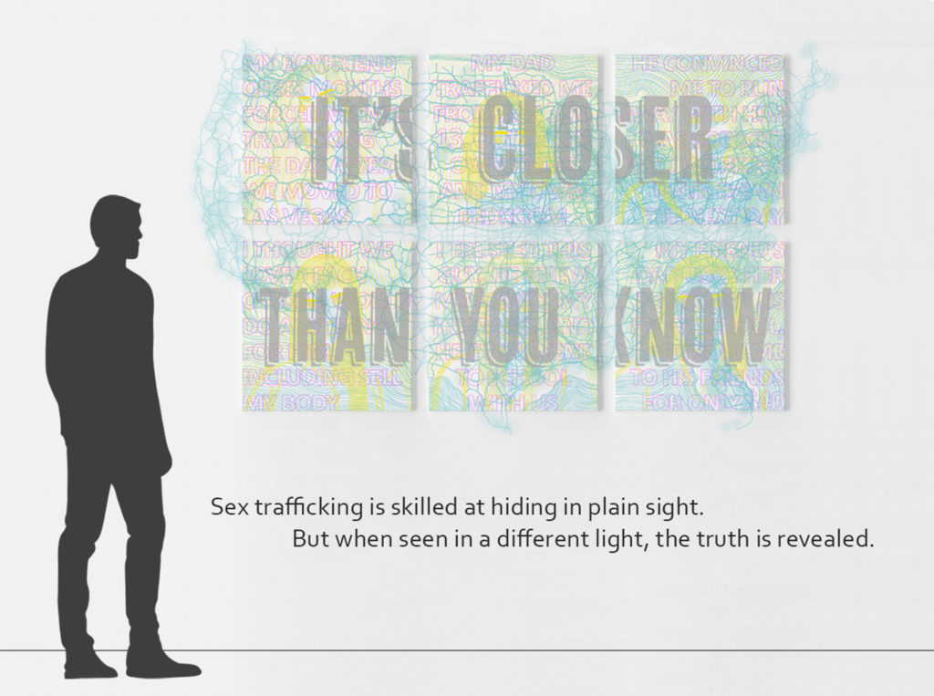
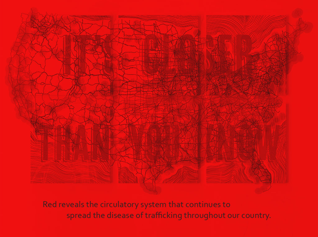
Nothing is better at hiding in plain sight than sex trafficking. Each light brings forward a color within the imagery that would otherwise be hard to see without assistance. The cyan is a map of the highways in our country. Or rather the circulatory system that keeps a steady flow of trafficking
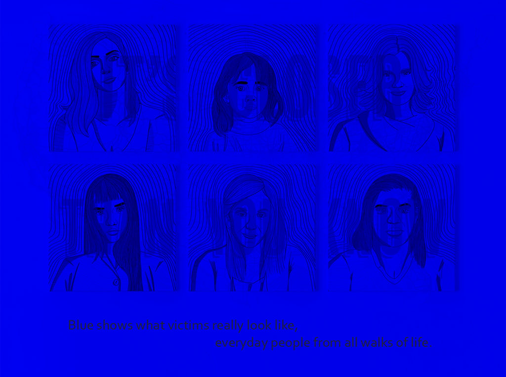
victims. On its own it appears to be a healthy functional system, but under red light it is revealed to be the disease filled system that it is. Spreading beyond its boundaries as it continues to grow more and more every year. The yellow portraits represent the survivors and victims of trafficking. In its
natural light they can be hard to see, but even in their blue light they still aren’t emphasized. Just like how those who have experienced trafficking are normal everyday people. They don’t fit a specific description so they can be hard to spot at first glance. The magenta typography shows real life
statements from trafficking survivors talking about their traffickers. Of the three colors magenta is the most dominant, whether in its green light or not. Most people would think that a trafficker would stand out as an obvious pimp, when really they only stand out because they are the people we are meant to trust. This is an issue that needs to be cast in a new light so we can see it for what it truly is and bring modern day slavery to and end.

More to Check Out
View her portfolio online at thatgirlpreston.com
Follow her on Instagram @thatgirlpreston